
If you’re a designer, it’s also a chance to showcase your style. Whether you include a playful sketch or a polished illustration of yourself, the image doubles as a subtle portfolio sample.
Vintage aesthetics
A vintage look can bring timeless charm and familiarity to your business card. To create a retro feel, play around with elements like old-style typography, faded colors, or vintage textures.
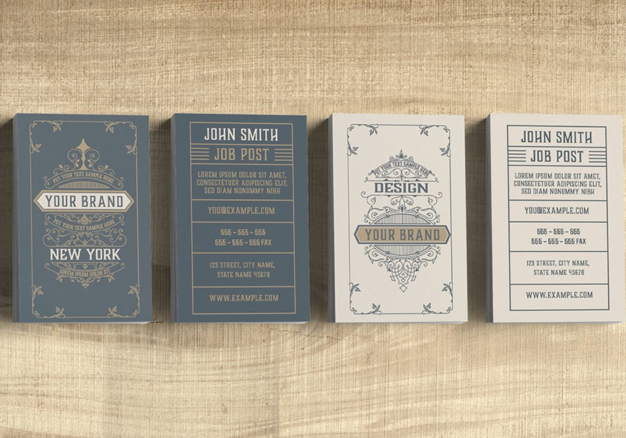
For design inspiration, look up old postcards, matchboxes, or typewriter fonts and borrow the elements that spark visual interest. This style can work especially well in creative fields, allowing you to express your admiration for classical designs while adding a unique modern twist.
Practical tools
Although the primary purpose of business cards is to share your contact information, you can also turn them into practical items. Cards that double as bottle openers or mini rulers offer great value and tend to stick around longer. People are less likely to throw away a tool they can actually use.
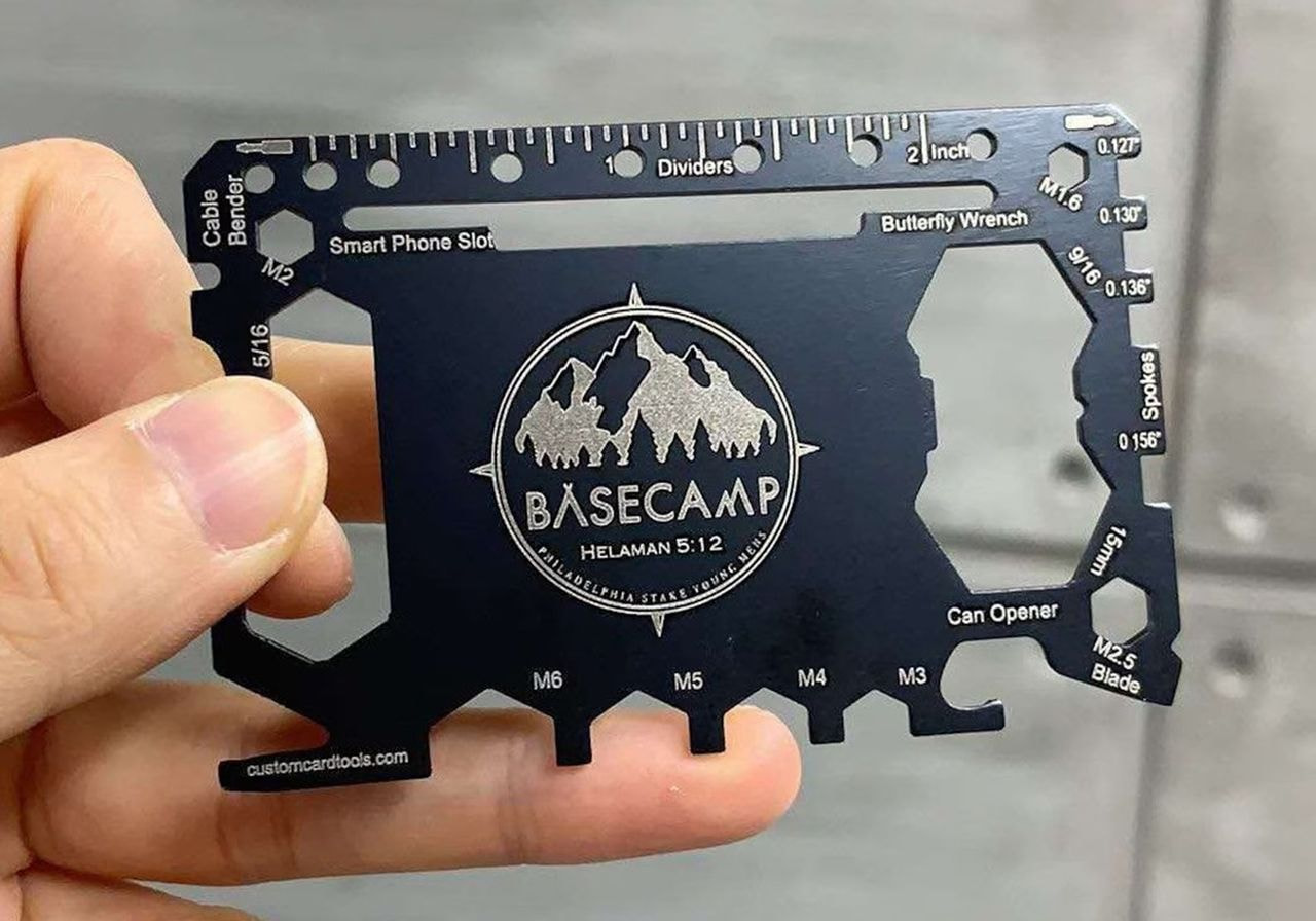
Source: CustomCardTools
This type of design can work well for hands-on professionals like engineers, builders, or designers, giving a sense of practicality and preparedness. Just make sure the card material is durable enough to serve its secondary purpose without sacrificing readability.
Eco-friendly materials
For many businesses, sustainability is a core value. If this cause is close to your heart, consider reflecting it in your business cards.
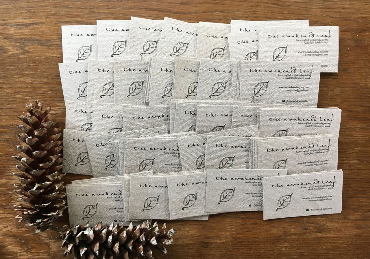
Source: RusticandSimple
Cards made from recycled paper or embedded with wildflower seeds send a clear message about your commitment to the planet. But be mindful. If you claim your card is eco-friendly, double-check that your print provider’s materials are sustainable and not just clever marketing.
Geometric patterns
Geometric patterns are a great way to add structure and style to your business card design. Bold shapes, repeated lines, or abstract forms can guide the eye while adding rhythm and energy to your card.
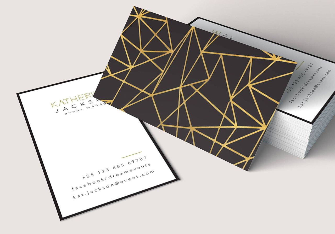
Source: UnicornWingsStudio
Whether you go monochrome or full-color, geometric layouts can feel both modern and timeless.
Dual-sided contrast
Why settle for one look when your business card has two sides? Dual-sided contrast lets you play with colors and layout to make both sides shine. One side might feature a bold brand color with light text, while the other flips the scheme to keep things interesting.
It’s a clever way to highlight different types of information, like contact details on one side and a logo on the other, while maintaining a coordinated look.
Edge-to-edge designs
Don’t be afraid to use the entire space of your business card. Edge-to-edge designs let your visuals flow right to the border of the templates. This approach works well with bold patterns and colors and large typography.
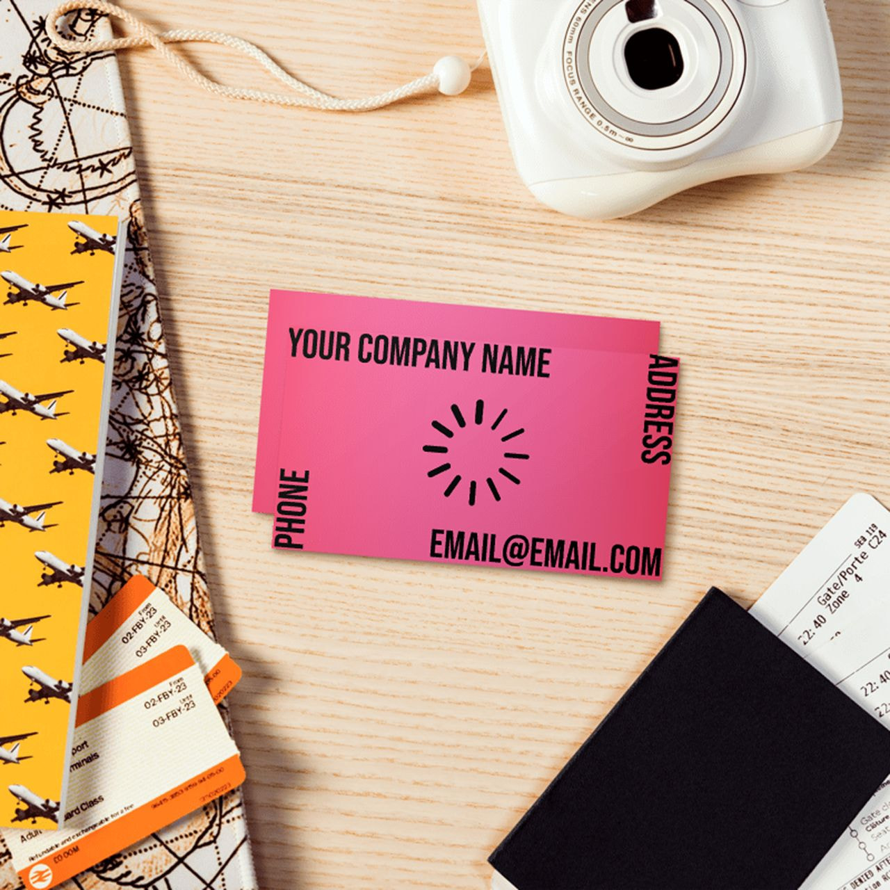
However, when working on your designs, always test them with your print provider. Colors can shift, and small details may get trimmed. Make sure your layout holds up in print and that all the essential info remains easy to read.
Feature your work
Let your card double as a mini portfolio. If you’re an illustrator or photographer, featuring your work directly on the card gives potential customers an instant sense of your style and skill. If you sell physical items, you can showcase them on your card too.
RELATED POSTS
View all
30+ Fresh tote bag design ideas for 2025 | Printful
August 10, 2025 | by deven.khatri@gmail.com
Best Kurta Pajama Colour: Trends, Combinations & Styling
November 20, 2025 | by deven.khatri@gmail.com
How to Style Casual Shirts for Men: The Complete Guide – VESTIRIO
September 10, 2025 | by deven.khatri@gmail.com