20 Famous logos and what to learn from them
January 12, 2026 | by deven.khatri@gmail.com
Famous logos stick in your brain long before you realize it. Think of the Nike swoosh on a hoodie, the Coca-Cola script on a can, or the Apple silhouette glowing on a laptop. These tiny visuals shape culture, spark emotion, and build entire empires. Here’s your backstage pass to what makes famous logos unforgettable and how you can craft your own.
What makes a logo famous?
Famous logos rise fast when a brand commits to clarity, repetition, and a visual story people remember. The best logos keep their shape over decades, adapt to new trends, and use design elements that land instantly at first glance. When a logo symbol feels timeless, recognition becomes effortless.
Here’s what helps logos break into the “famous” tier:
-
Consistency across products, ads, and digital platforms
-
Simplicity that survives any size, format, or background
-
Symbolism tied to what the company name stands for
-
Emotional pull that sticks longer than the original logo
-
Adaptability without losing core logo features
-
Color choices that create a lasting impression
-
A clear story, even without words or hidden meaning
Together, these ingredients shape famous brands that carve out space in culture and stay recognizable for generations. Now let’s take a closer look at some of the most successful logos and uncover what makes each one so memorable.
20 Most famous logos and their stories
1. Apple
The Apple logo started as a detailed illustration but quickly shifted to the clean silhouette everyone knows. Its power comes from stripping the idea down to a bold, unmissable shape that works at any scale.
The bite adds balance and creates instant recognition. It’s one of the most famous logos because it communicates innovation without a single word. The simplicity helped Apple shape a sleek, modern brand that audiences connect with instantly.
2. Microsoft
Microsoft’s four-color window squares bring clarity to its mission of connection and creativity. The earlier mark leaned more corporate, but the refreshed design introduced a friendly, modern structure.
Each square hints at a product category, giving the layout a subtle logic. The uniform geometry keeps the logo steady across products and screens. It’s recognizable at first glance, and its approachable tone reflects a company built around everyday digital experiences.
3. Google
The Google logo thrives on color, rhythm, and personality. Its playful mix of hues breaks tech’s old rules and keeps the identity approachable. Over time, Google moved from serif lettering to a cleaner, geometric style that feels modern but still warm.
The shifting doodles helped audiences connect with the brand on a human level. This balance makes it one of the most famous logos used across global search, tools, and platforms.
4. Amazon
Amazon uses a friendly arrow that runs from A to Z, showing range, delivery, and movement in one gesture. That small curve also resembles a smile, adding warmth to the mark. It’s a concise visual summary of ambition and convenience.
The stability of Amazon’s logo across the years helped shape trust, especially as new services appeared. It delivers meaning through a single stroke, which gives the icon lasting power.
5. Facebook
Facebook’s mark leans into simplicity, pairing a calm blue tone with a familiar rounded form. Subtle updates over the years kept the current logo fresh without removing its core shape. The pared-down structure shows how color psychology supports a platform built on connection.
While styles change, this identity still competes with the most famous logos thanks to its clarity and approachability across billions of screens.
6. YouTube
YouTube’s red play button tells the entire story without extra decoration. Earlier versions used a more dimensional style, but the simplified one feels sharper and more focused. The symbol works everywhere – from TV apps to tiny mobile screens – and contains the entire platform’s purpose inside one shape.
It rises above many company logos because it blends utility and personality, making it easy to spot in any media lineup.
7. Coca-Cola
With its flowing script and energetic curve, Coca-Cola shows how typography alone can express joy and tradition. The style stays remarkably close to the original, which keeps the heritage alive. Its red and white palette became part of global culture, and even seasonal variations never stray far from the core.
The design creates a festive feeling at first glance, making it one of the most famous brand visuals ever created.
8. Pepsi
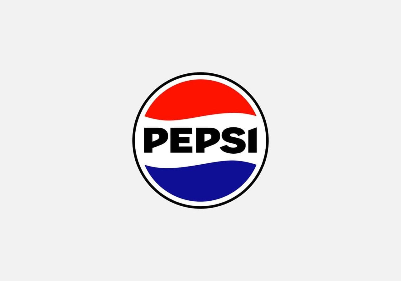
The Pepsi logo keeps its circular shape but has evolved through decades of reinterpretation. The wave inside reflects motion and freshness without overwhelming the layout. Its red, white, and blue palette is bold yet balanced, helping the mark stand out on shelves worldwide.
As the geometry became cleaner, the personality sharpened, giving Pepsi a crisp, modern look. The refreshing symmetry contributes to its place in global visual culture.
9. Nike
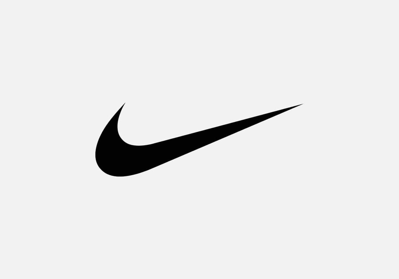
The Nike swoosh delivers one of the cleanest examples of movement captured in a single stroke. Inspired by a goddess, it expresses speed, ambition, and athletic energy instantly. The mark originally cost just a small commission, yet it grew into a cultural icon recognized everywhere.
This fluid curve proves how a minimal form can create a powerful, lasting impression, shaping one of the most successful stories in design history.
Valuable read: Clothing brand logo design principles
10. Adidas
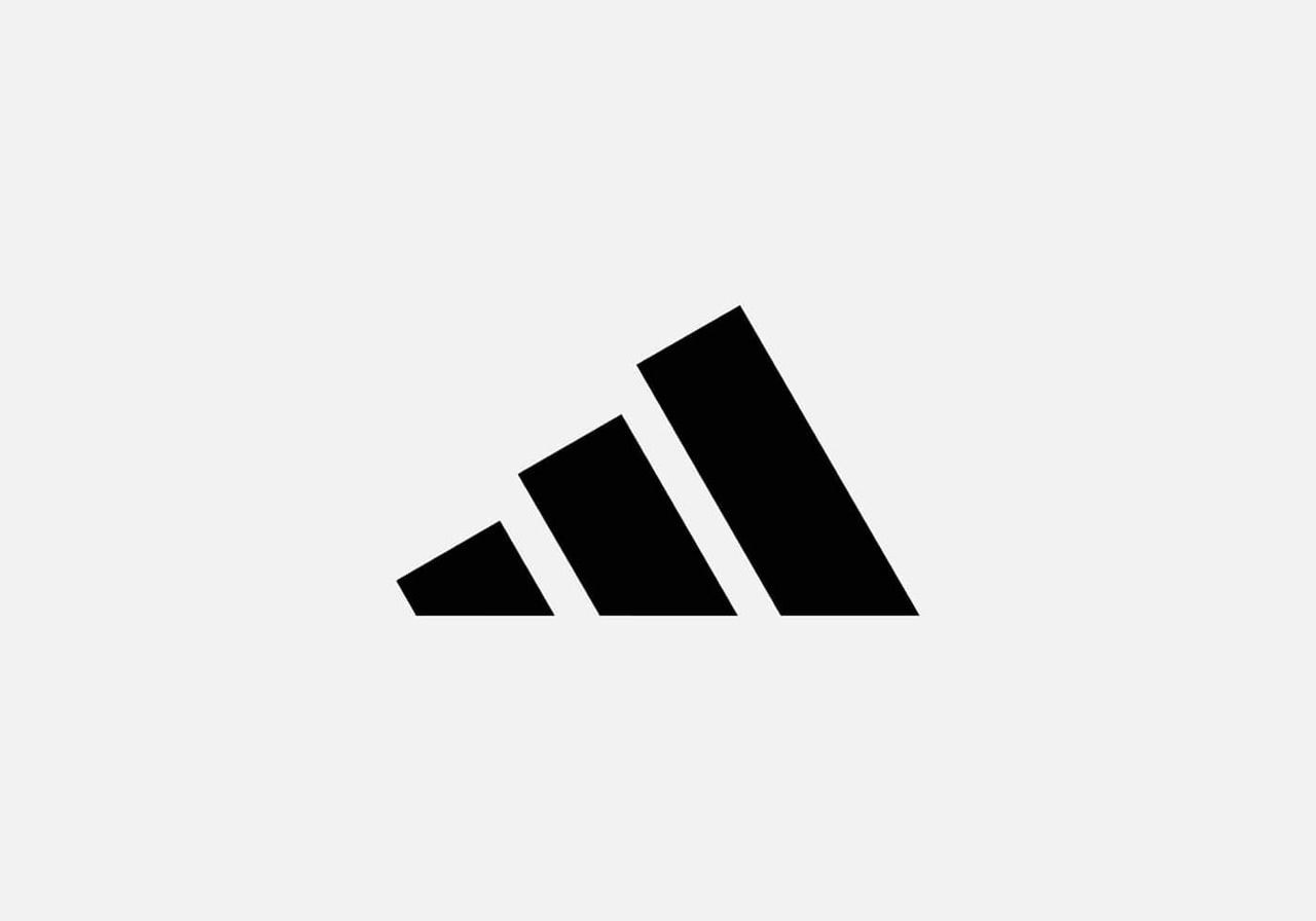
Adidas has explored several geometric directions, but the three stripes remain the constant thread. The angled trio suggests mountains, grit, and progress. Earlier versions were flatter, while later ones added depth or varying line weights. Despite the evolutions, the brand’s core rhythm stays recognizable.
The strength of the concept, not ornamentation, keeps the identity memorable. It’s a reminder that repetition and symbolism can create enduring clarity in sports culture.
RELATED POSTS
View all

Casual and Formal Shirts for Men – Complete Style Guide 2025 – VESTIRIO
September 19, 2025 | by deven.khatri@gmail.com

The Ultimate Style and Comfort Guide for 2025 – The Souled Store
August 25, 2025 | by deven.khatri@gmail.com

How to make money as a stay-at-home mom in 2026
January 6, 2026 | by deven.khatri@gmail.com